KIVETT & MYERS
BACKGROUND
In December 1966, federal officials judged Municipal Airport “unsafe for large jet aircraft” so the city initiated extensive studies for construction of a terminal and aviation needs at MCI. Two firms, Kivett & Myers, architects, and Burns & McDonnell, engineers, were hired to prepare design concepts. Eight design concepts for the new airport had been considered, and ultimately, the “Drive-to-your-gate” concept was selected.
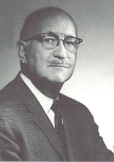
Photograph of Clarence Kivett from The Kansas City Star.
DESIGN & CONSTRUCTION
Kivett & Myers
Clarence Kivett is often credited with bringing modern architecture to Kansas City, not just in the buildings that he designed, but in the numerous architects that he trained. His firm, Kivett and Myers, designed dozens of Kansas City landmarks, including Kansas City International Airport, the Alameda Plaza Hotel (now the Ritz-Carlton), the Missouri State office building, and the Truman Sports Complex. The firm is also responsible for designing airports in Munich, Germany and Lisbon, Portugal.
During its glory years from 1945-1975, Kivett & Myers was the leading architectural design firm in Kansas City and won 30 of the 73 design awards given by the local chapter of the American Institute of Architects (AIA). Kivett & Myers encouraged bold, modern buildings designed by quality architects, and the firm operated as a training ground, providing instruction to young architects. Kivett & Myers received more than 200 design awards before merging with HNTM Architects in 1975.
Architecture
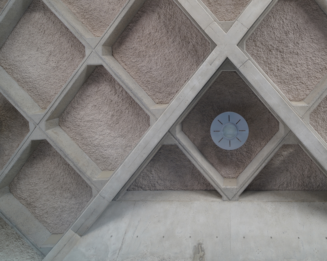
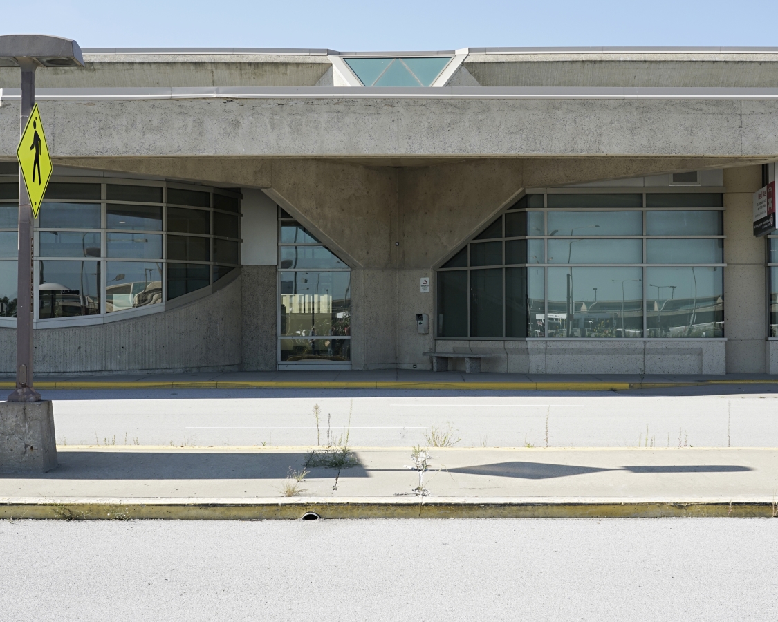
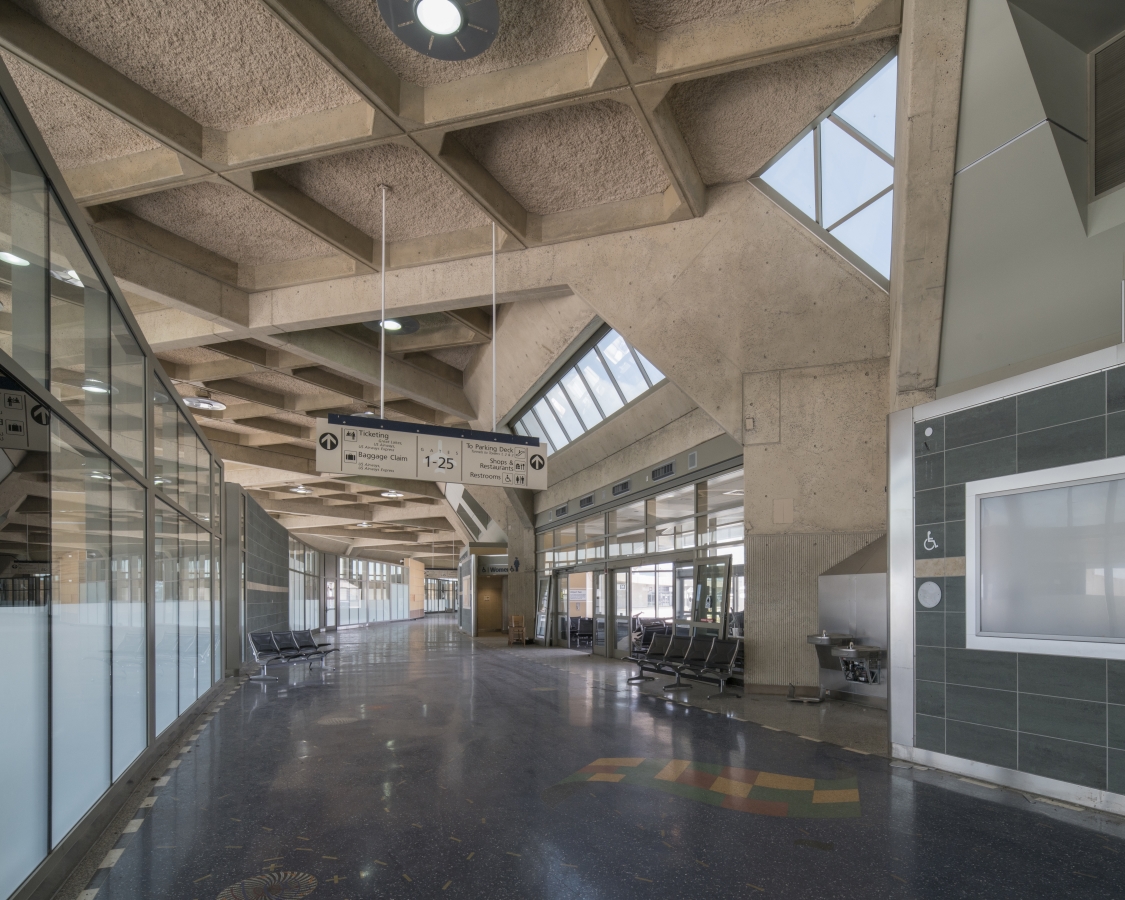
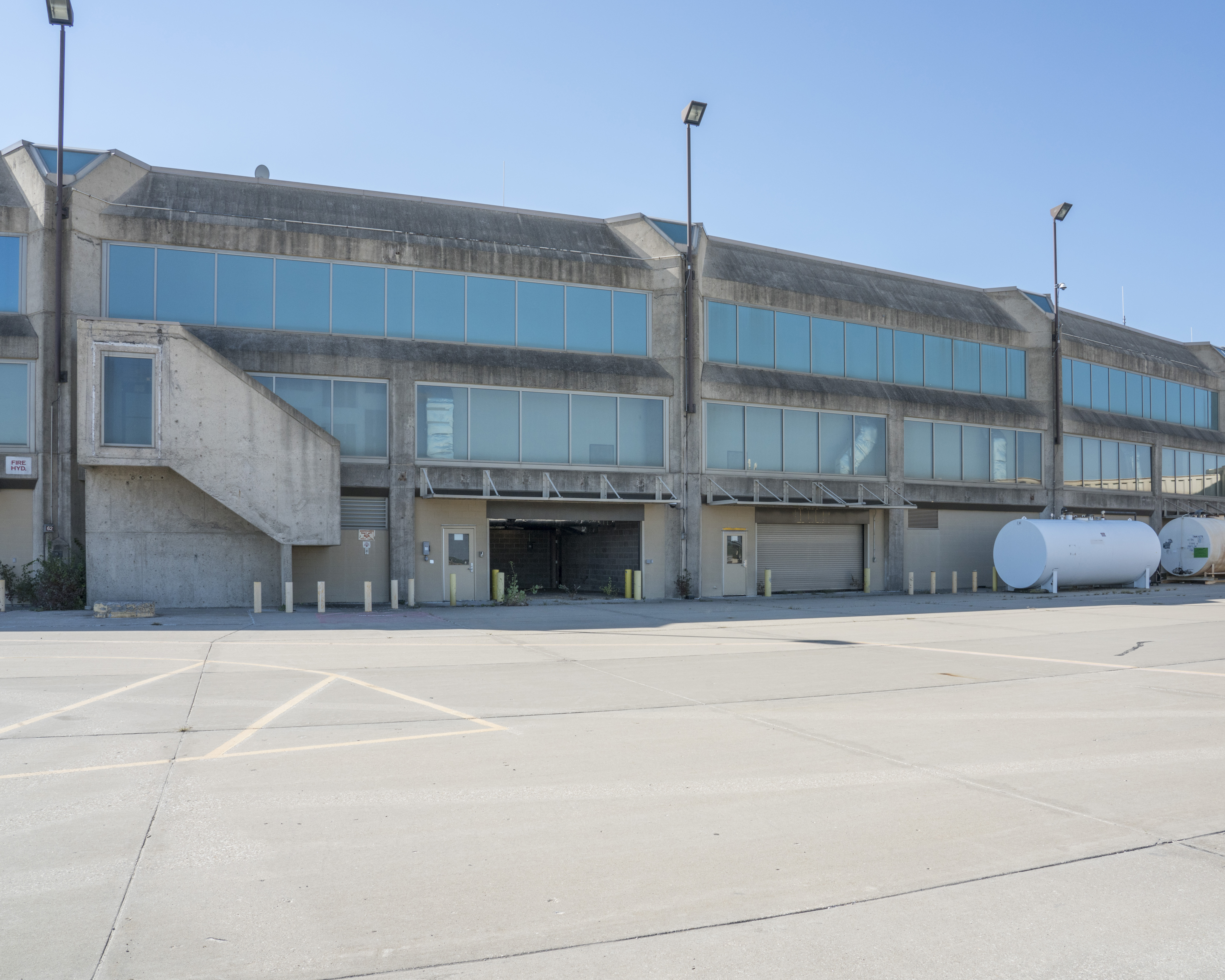
The passenger terminals at KCI, designed by Kivett & Myers with engineering work by Burns & McDonnell, are examples of the Brutalist style of architecture, which was widely used for public buildings in the United States in the 1960s and 70s. Brutalist buildings are characterized by a ‘blocky’ appearance with a rigid geometric style and large-scale use of poured concrete. Brutalism is also known for rough, unfinished surfaces and unusual shapes, as can be seen in the honeycomb ceiling of the passenger terminals at KCI. The exterior and interior of each terminal, as originally designed, features unique structural components that further characterize KCI’s landmark design. As described in Architectural Forum:
The structure is equally simple; V-shaped columns, 40 ft. high, on the aircraft side; and Y-shaped columns, 26 ft. high, on the landside. Concrete roof bents connect the columns in a “diagonal” pattern, and waffle slabs span between these in a diamond-shaped grid. The concrete was cast-in-place and left exposed. [1]
[1] “Kansas City International”, Architectural Forum, 136 (May 1972), 28.
Drive-to-your-gate
KCI’s passenger complex also illustrates a novel design concept for airports. A typical airport terminal of the early jet age had a centralized hall through which all passengers entered, with corridors along which gates were located (finger piers) or extending out to aircraft parking locations (satellite design). Because Kansas City has very few transfer passengers, TWA advocated minimizing the distance between the curb where passengers were dropped off and the gate at which they boarded the aircraft by employing a linear design, with ground access on one side and aircraft gates on the other. This became known as the “Drive-to-your-gate” or gate-arrival configuration.
The KCI passenger complex embodied the “Drive-to-your-gate” concept and was the first of its kind implemented worldwide. “It is the world’s shortest walk to fly,” architect Clarence Kivett told The Star when it was finished. “There’s nothing like it in the world.”
The terminals were linear, measuring 65 ft. wide and 2,300 ft. in length, but were curved to create 80% of a full circle 1,000 ft. in diameter. [2] Each building had three levels: passengers entered from curbside to the middle level, containing ticketing and other passenger services, and proceeded directly to their gate; a mezzanine above contained restaurants and cocktail lounges, as well as VIP rooms; and the apron level below provided access for airline and airport employees to aircraft parking positions, utility, and service facilities.
Unfortunately, by the time the terminals at KCI opened, the FAA had imposed a new requirement for passenger and baggage screening that made the terminals’ decentralized layout and open plan problematic from the start. Almost immediately after construction was completed, glass walls were added to the interiors to separate the ticketing and boarding areas, security checkpoints had to be created for each gate, and much of the convenience associated with the original design was compromised.
[2] Hanan A. Kivett, “Kanas City International Airport: World’s Shortest Walk-To-Fly,” American Society of Civil Engineers National Transportation Engineering Meeting, July 17-21, 1972, Milwaukee Wisconsin.
CONSTRUCTION OF KCI
To see the full video on development and construction of the original KCI terminals please click here.

